This Point Blank Music School instructional video is about DVR: Electronics Music Composition. The instructor…
MikeSorensenJanuary 14, 2015
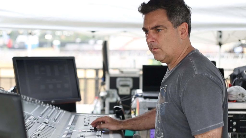
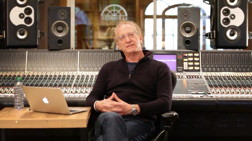
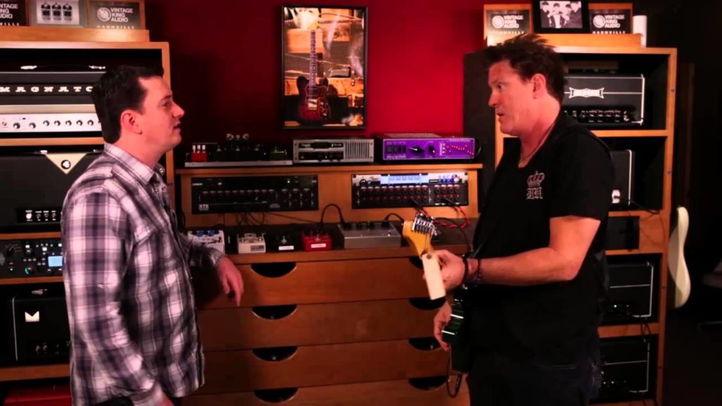
If you like audio and music then this section shows some of the news stories on other sites that we find interesting and worth pointing out.

![]()
I am an acoustic engineer with over 30 years’ experience in the business. My technology has been used in Electric Lady Land Studios, Sony Music of New York, Cello Music and Films founded by Mark Levinson, and Saltmines Studios in Mesa, Arizona, along with hundreds of others.
© 2025 Acoustic Fields